a homepage as bold as the mayo: redesigning the online home of mayoneur

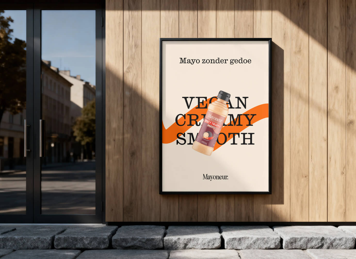
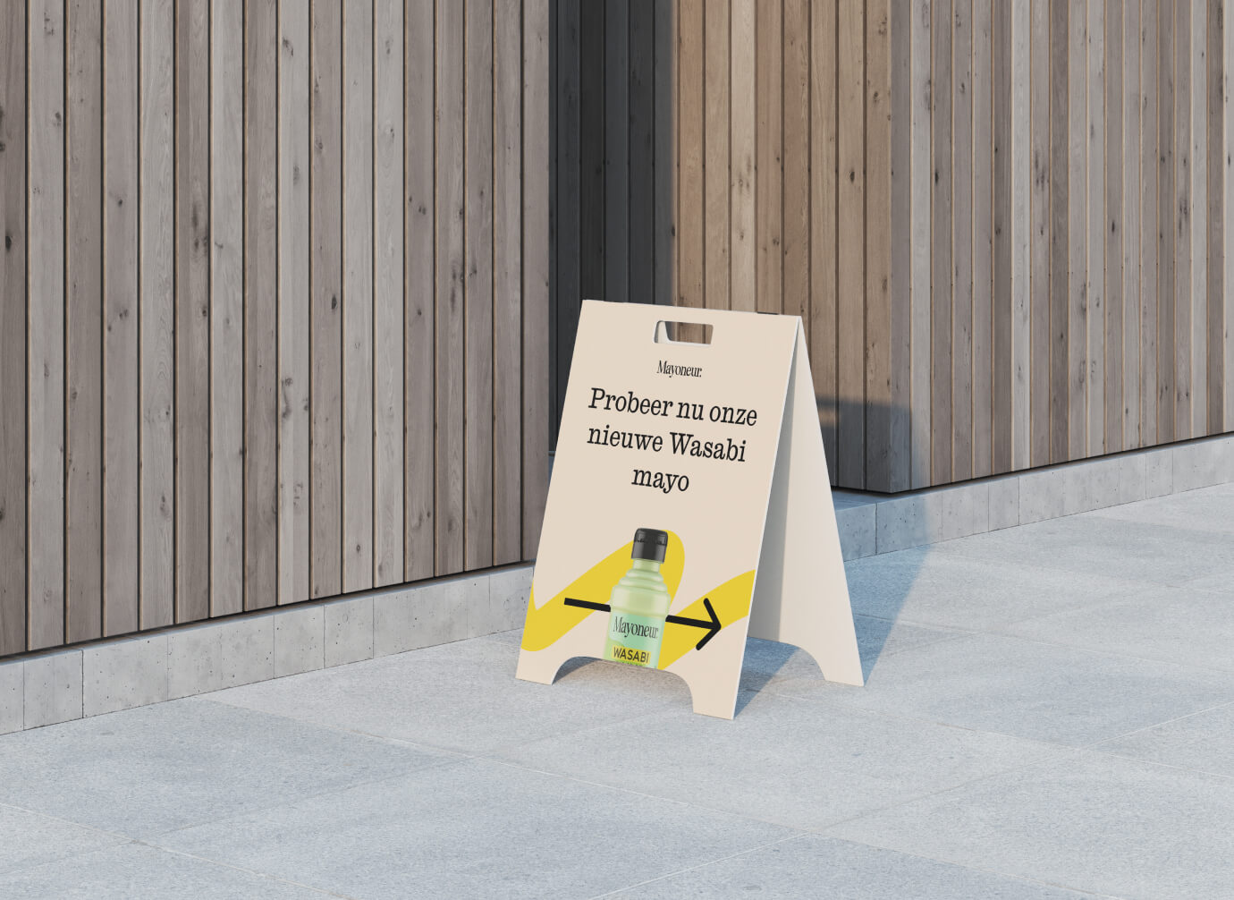
Mayoneur makes plant-based mayo that’s anything but plain: from Sriracha to Spicy truffle, in supermarkets across the Netherlands.
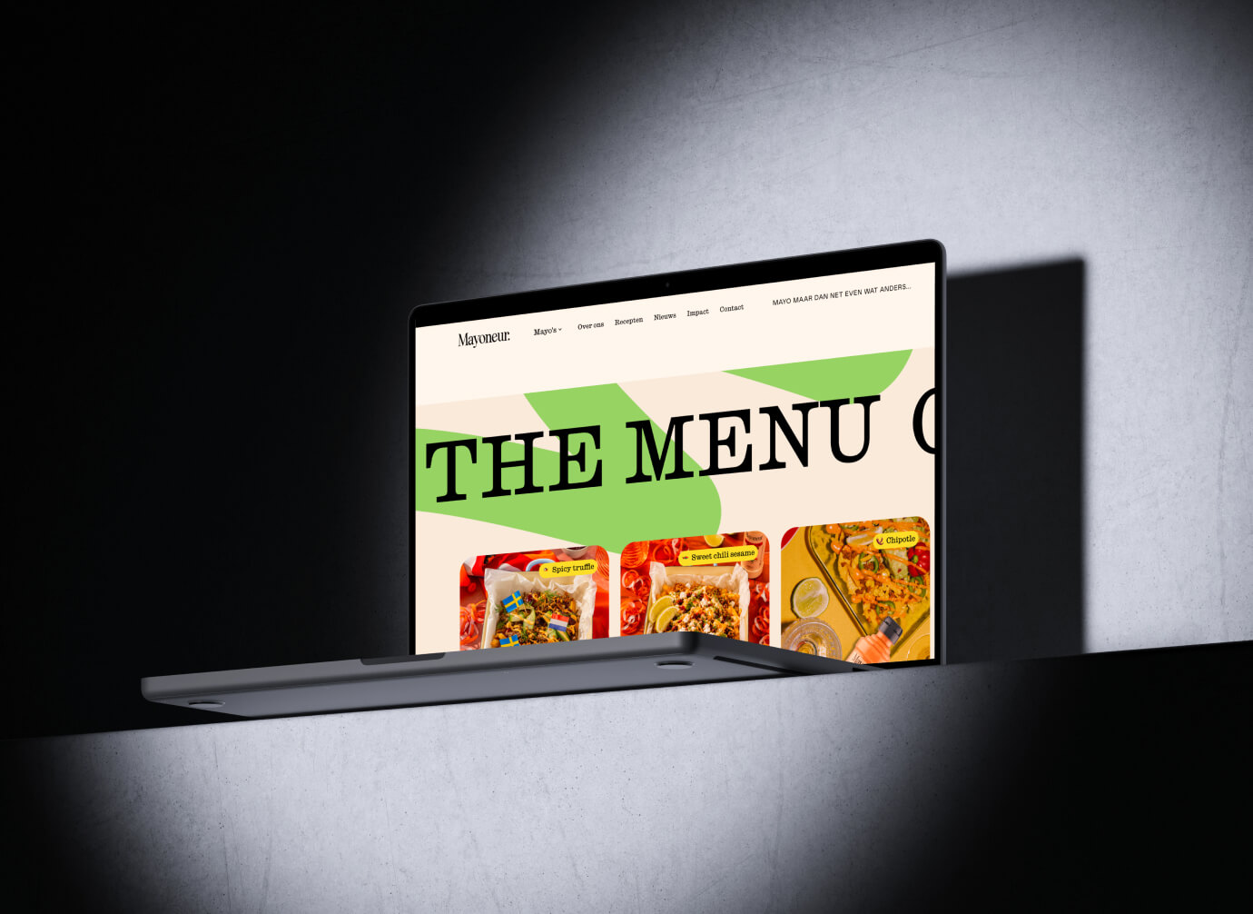
I built their website a few years ago and have been their web partner ever since. This year I redesigned and rebuilt the homepage, to match where the brand is today.

challenge
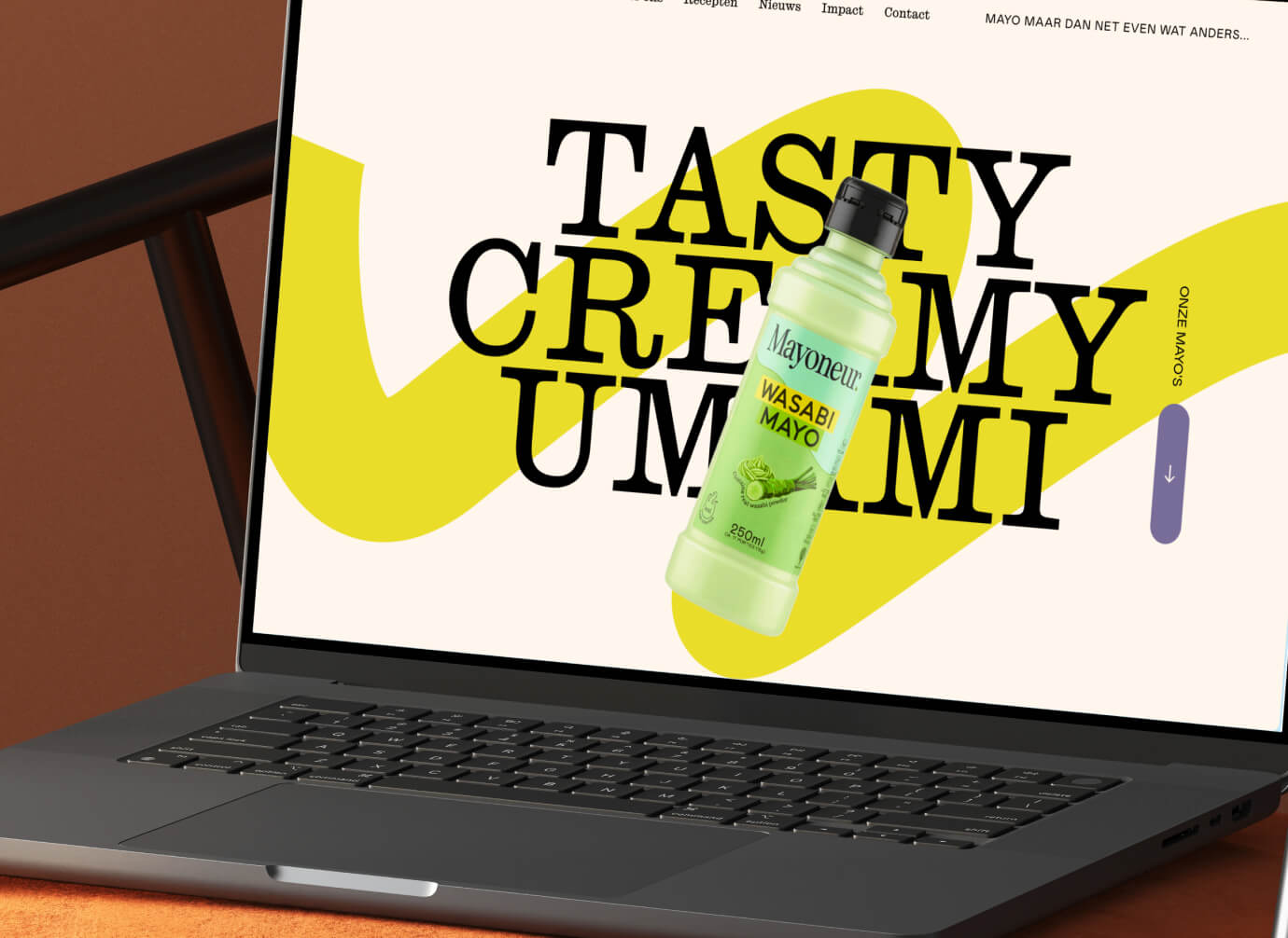
Mayoneur grew fast. From a pitch on Dragons’ Den to shelves at Albert Heijn, Jumbo, Plus and more, with new flavours, recipes and a growing sustainability story. The homepage had to keep up: show eight flavours, tell people where to buy them, prove the brand is serious about its mission, and still feel as playful as the jars themselves.

approach
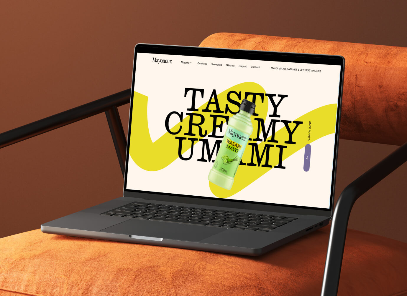
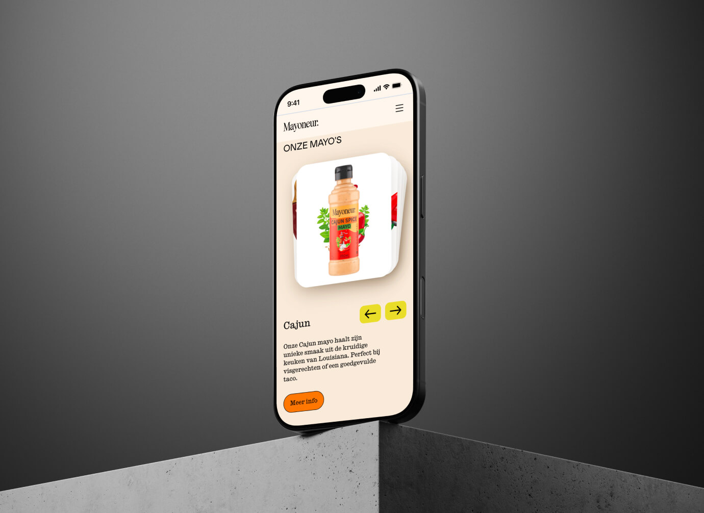
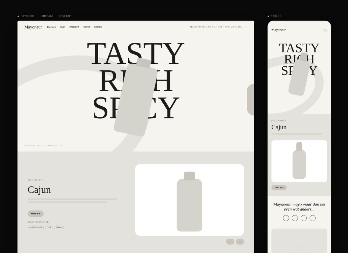
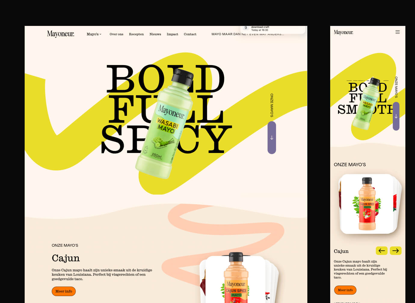
Every section got one job. First make you hungry, then show the flavours, then tell you where to find them. The brand’s personality led the way: short, bold copy, lots of colour and movement, and the products always front and center. Because I know the site and the team inside out, I could design with the CMS in mind, so Mayoneur can add new flavours, recipes and retailers without needing me.


design
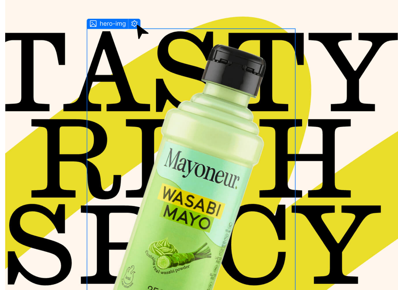
Loud, tasty and unmistakably Mayoneur. A hero that puts the newest flavour in the spotlight, scrolling words like “tasty” and “bold” running across the page, and product cards with flavour icons and dietary badges at a glance. Recipe carousels make you want to cook, and a wall of retailer logos shows you exactly where to buy.
build
Built in Webflow and fully driven by the CMS: flavours, recipes, retailers and news are all managed by the team themselves. Carousels, marquees and smooth interactions bring the brand to life, without slowing anything down. Fully responsive, because most people discover new food on their phone.

result
A homepage that finally tastes like the brand. Mayoneur now has a site the team can grow on their own, telling the full story: from the flavours to the 1,160 trees planted so far with Trees for All.